Data Visualization Tools Revolutionize Basketball Wagering Decisions
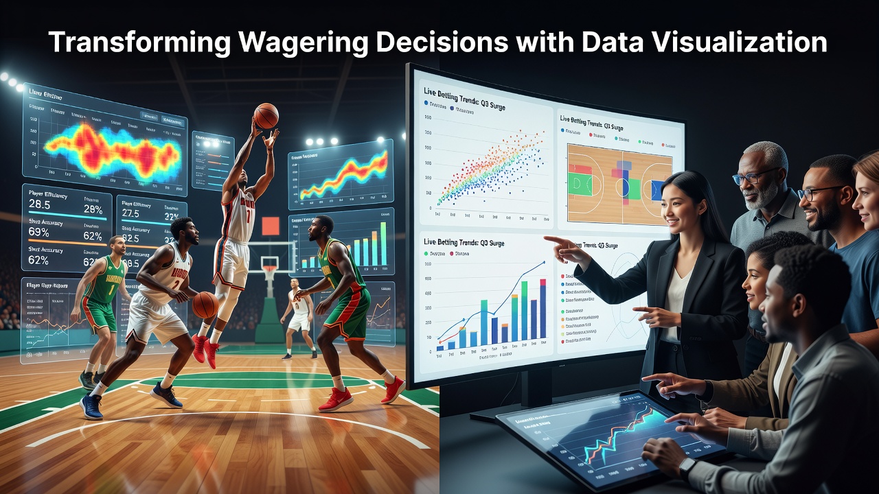
Observers note that data visualization platforms have reshaped how enthusiasts approach wagering on basketball leagues since interactive dashboards first gained traction around 2023, and these systems continue expanding their reach into July 2026 with fresh integrations across major professional circuits. Those who track betting patterns point out that tools converting raw statistics into heat maps, trend lines, and probability charts allow users to spot value in player props or team totals without sifting through spreadsheets, while real-time updates during games help refine in-play selections on the fly.
Core Features Driving Adoption
Modern platforms aggregate box scores, advanced metrics such as player efficiency ratings, and shot-location data into layered graphics that update automatically, and researchers at institutions like the University of Nevada Las Vegas have documented how these interfaces reduce the time needed to evaluate matchups by roughly forty percent compared with traditional text feeds. Bettors gain access to side-by-side comparisons of opposing lineups, historical performance under specific coaching schemes, and injury impact simulations rendered as simple color-coded overlays, which means decisions about spread or over-under wagers rest on clearer patterns rather than isolated numbers.
What's interesting is the way filtering options let enthusiasts isolate variables such as fourth-quarter scoring trends or three-point volume against elite defenses, and industry reports from the American Gaming Association highlight that leagues in North America and Europe now supply official APIs feeding these visualizations directly to licensed operators. This direct pipeline keeps the displayed data synchronized with live play-by-play feeds, allowing rapid adjustments when a key rotation change occurs mid-game.
Real-Time Application in League Play
During high-profile matchups in the NBA and EuroLeague, visualization suites overlay live win-probability curves that shift with each possession, and people who monitor these curves often notice momentum shifts before the scorebug reflects them on television broadcasts. One documented case involved a mid-season tournament game where a sudden spike in defensive rebound visualizations prompted swift movement on under totals, demonstrating how the graphical format surfaces correlations that raw play-by-play logs bury in columns of text.
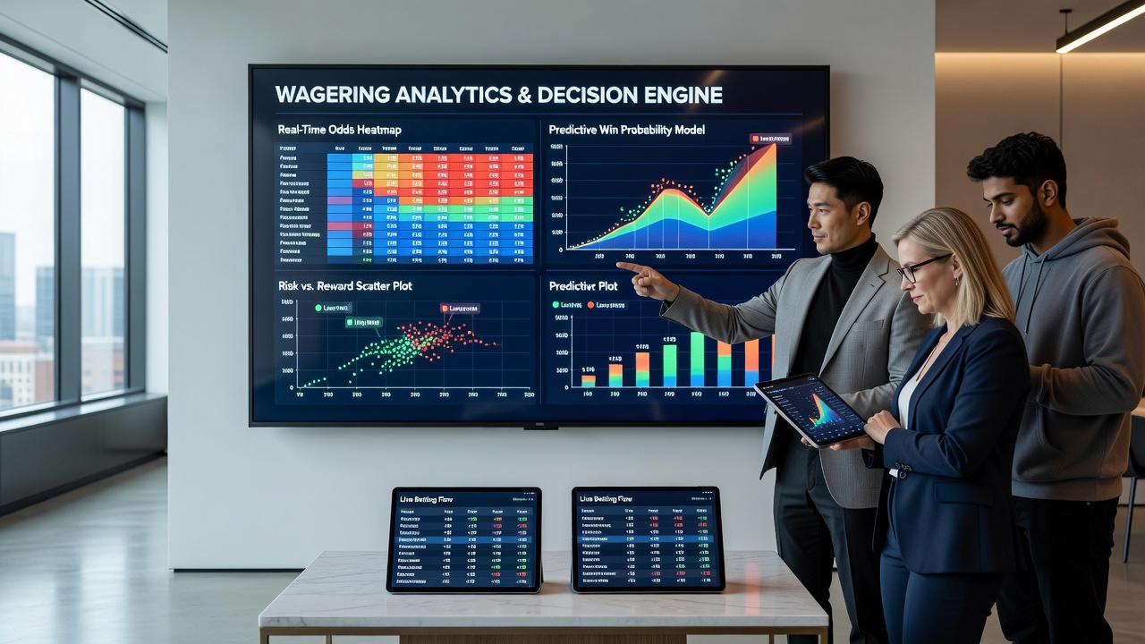
Operators in Australia report similar uptake after the Victorian Commission for Gambling and Liquor Regulation approved new display standards for interactive betting interfaces, and these standards require clear labeling of data sources so users understand whether a given graphic draws from season-long samples or the current quarter alone. Such transparency helps maintain consistency across different time zones when international bettors access the same league markets.
Integration With Mobile and Streaming Ecosystems
Developers have embedded visualization modules directly into streaming apps, which means a viewer watching a broadcast can toggle a sidebar showing defensive coverage heat maps without leaving the main window, and this seamless access has coincided with increased engagement in player-performance markets during July 2026 summer league events. Those who study user behavior note that sessions featuring combined video and graphic displays last longer on average, because the visual layer supplies context for each on-court action as it unfolds.
Canadian provincial regulators have examined similar integrations and found that clearer visual cues correlate with more measured bet sizing, since users can quickly reference historical context before confirming selections. Academic papers from Canadian research centers further suggest that color gradients representing variance in shooting percentages help temper overreactions to single-game outliers, thereby supporting steadier decision flows across extended slates.
Conclusion
Data visualization continues to mature as leagues expand their data partnerships and regulators refine display requirements, and the combined effect keeps basketball wagering tied more closely to observable performance patterns. Enthusiasts now navigate markets using graphics that compress complex datasets into intuitive forms, which in turn supports quicker yet more informed selections during both pre-game and in-play windows. As these tools evolve through 2026 and beyond, the emphasis remains on accurate sourcing and real-time synchronization that let participants follow the action with greater clarity across global basketball competitions.